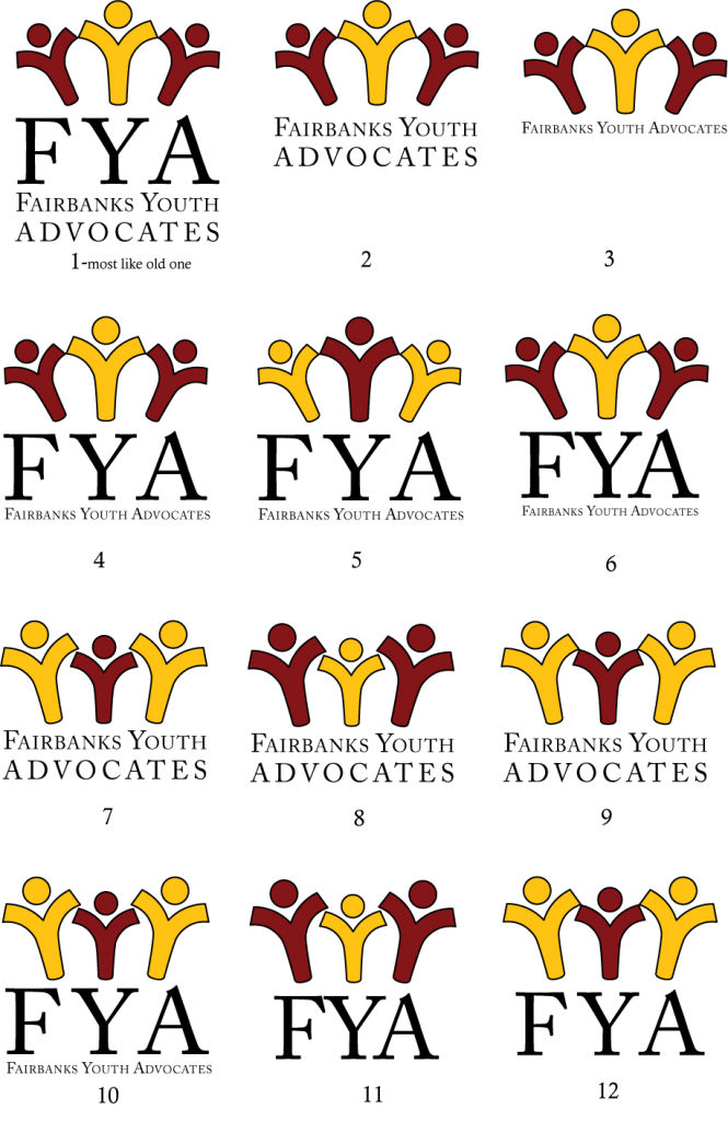
The public information committee met yesterday, after many rounds of discussion and consults regarding the logo. We took an element from Damien’s design and pushed it through many iterations. Guiding our final selection were these elements:
- simple
- easy to read in many different sizes
- collaboration
- youth
We all agree that version number 1 does this the best. There can be many variations of how the font is rendered, and placed, but the three Y people are the critical branding element. Yellow is a cheerful and attractive color. The circle people was a clever idea, but it takes a little too much time to process and figure out.
We need to go to print on Friday for a banner project for the farmers market, and would like your general feedback as soon as possible. While the committee appropriately sheltered the board at large from all the nit picking discussion, we would like your general approval and/or comments before locking into this.
+++++++++++++++++++++++++++++++++++++++++++++++++++++++++++++++
Per Sarah’s comment, here is a version with the hands touching
+++++++++++++++++++++++++++++++++++++++++++++++++++++++++
For now, it looks like number 2, 4 or 6 will be a good starting point, as it includes our full name. Other text arrangements may be incorporated into various designs.


number 10 is good: hands touching, young person supported by adults, FYA elaborated. It sounds like we will be using various versions of it? great agenda clarification 🙂
The hands touching is fine. I’ll go with the flow.
I like the hands touching. good work.
Sarah – Thank you, as soon as I shared your thoughts about the pushing away. . . our Vista Sarah said she had been given that same response by someone she showed last night.
Today I showed the logos, including the last logo that Patrick added with the Y hands touching to the Youth Focus Group of the FHHC. We got very positive responses on the last one, and several people said that any of them would be awesome.
So – it is safe to say we are on the right track!!!
I like the #1 logo with the “Y’s” touching. I think it is a clean look and a clear message to a person who doesn’t know our organization. Great job!
Sarah,
Your comments are very much worth considering. There was another version of the Y people with their hands touching, which may mitigate the idea of being pushed away. The variation in size is to imply adult/youth connection and assistance, but it should communicate a positive, not negative idea in the very first look. We all liked the circle concept, because of the design, shape, and concept, but it looked like flowers, a celtic symbol, or snowflake, and not until a closer look did one think about people, or about youth. So we moved away from that to something more straightforward. I’ll post another version of the logo with the hands touching.
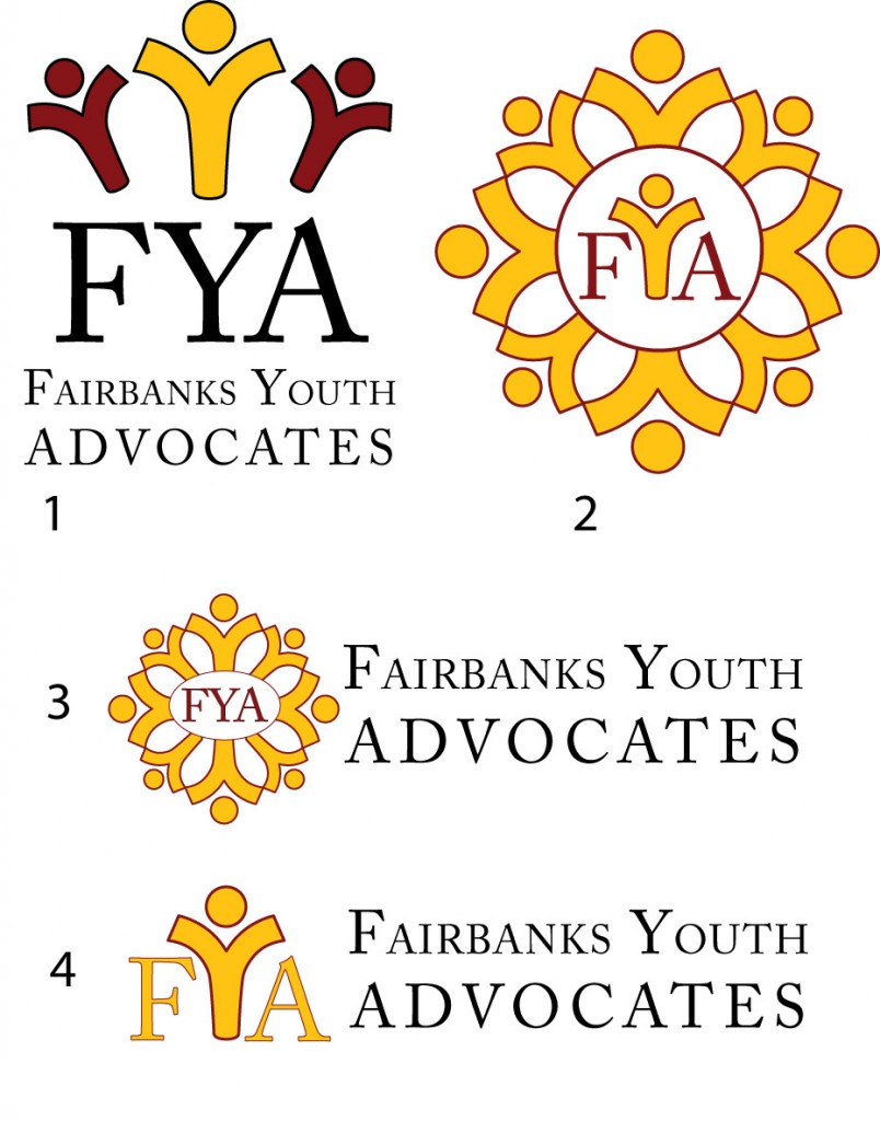
At first look, the circle of Y-People designs are the most appealing to me. BUT I agree that they look more like flowers than people– and I like flowers and circles, so that’s probably why 2 and 3 appeal to me most. 2 is better than 3 because the Y is a person, so the reader can make the connection that the y’s around are also people.
For some reason I am not as impressed by number 1- It appears to be a big yellow person in the middle and the two smaller people on the side seem to be getting pushed out of the way by the middle one. This sends a message to me that the helping adult is more important than the youths. Maybe I’m reading waaayyy too much into it, but that is how I view that design.
I like the simplicity of number 4 if we’re using the Y-person idea, but it doesn’t bring in the idea of collaboration.
I know you have already spent hours and hours pondering these very nitpicky ideas and here I am bringing up more details! So, with all of that being said, I would be happy with ANY of these logos. I think they would all serve our purposes. I will have to say that number 2 is my favorite (even if it looks kind of like a yoga center image….hey, brings about a certain calming effect for me!).
I’ll show this to my designer/artist husband and post again.
GREAT WORK PUBLIC INFORMATION COMMITTEE!!!!