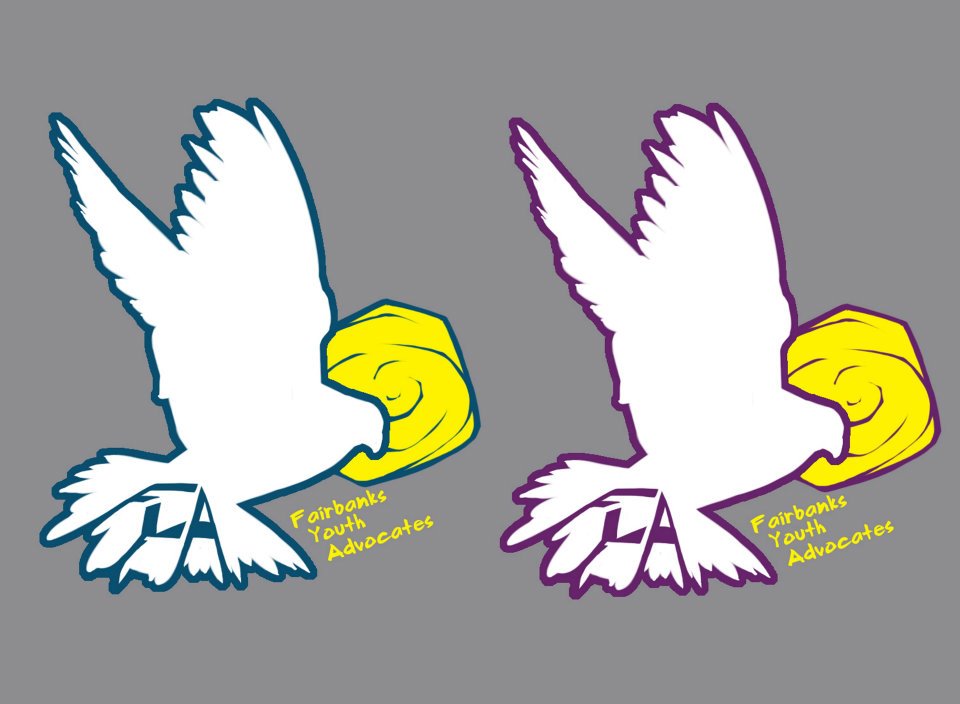
I gathered the submissions for the FYA logo contest from Facebook and am posting them here for an environment for us to discuss. At this point, we don’t have to choose one, but we should at least make a decision as to whether we want to or not. So, share your thoughts. Either a vote, for which one, or parts or pieces that may serve for further direction in a round two platform.


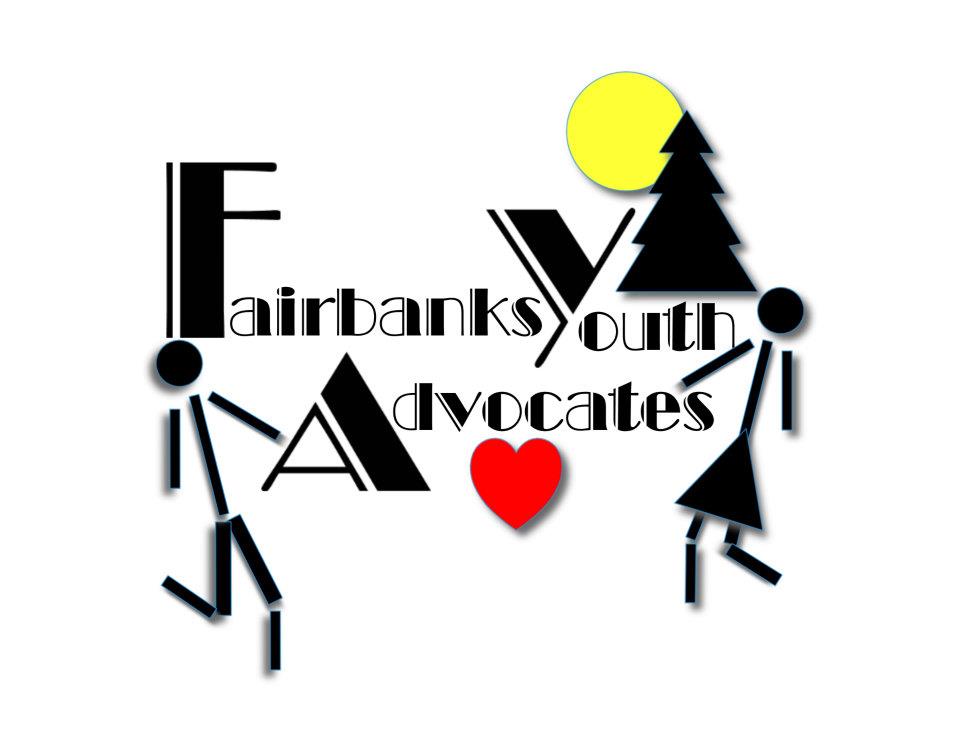
oh, just thought-maybe we already plan to, but to give the youth business cards of place, times, phone number-could give them to kids we see on the street, to organizations, (school district etc) who suspect someone is homeless. I still like #5 🙂
so, if we are aiming towards appealing to supporters, and not to the youth who we will be serving, number four is good.
Which logo was winner Damien Snook’s?
The red heart.
I kinda feel the same way as Patrick on this…..and I also can see that the logo will have more significance for donors than clients……I was just kinda thinking out loud about the disparity between the privileged and the disenfranchised………I like simple too which is why I liked #1 it is the simplest…..and if Patrick can bring on help from a graphics person that would be great….collaboration will help……even this little dialogue about a logo is energizing…….and I love being on this team……….
We’re so glad you’re on this team!
Logo comments: Thanks all for the feedback on this.
I’m not really excited about any of them. It is worth being picky about a logo. Some of the necessary basics as I see it are:
simplicity, simplicity, simplicity, and then, a general feel that represents the guts of the organization. It needs to be easily understood and look o.k. in a variety of sizes, and have a color palate that is not too complex or varied.
Based on that, I like #1 for its easy read, although it is not quite there.
In terms of clientele, the FYA logo is likely to be used to reach supporters more than the actual kids. The Door on the other hand, should probably have a stronger appeal to youth.
I would suggest we consider the progress made so far as direction towards another version. I’m not sure the best way to approach this, whether it is broadcast more widely, or solicited to a few? While we think about that, I’m going to send it off to a graphic artist I know to see if he has some feedback or suggestions.
I like #4 the best with the the second, bolder font being my first choice.
I like #1 , maybe with color changes…I was hoping for some darkness……I’d bet every submitter has a comforter on their bed and get lots of hugs……..our clients will know Trent Reznor & Ozzy…..not Glee….
Maybe it’s more important to be bright and hopeful………I guess
#2, 3, 6 are safely out then!
#7 is unclear and not meaningful enough – the dove and sun – but I like the rawness or the edge that it has.
I do like #4’s clever and thoughtful contribution – but I agree with Sarah – color would have to change – and maybe it still would not work as it is very close to FCA’s. The second, stronger black print is best though.
#1 “Blue Dot” has my attention – but I think a variation of it would work better. The F is a little flat – the colors not quiet right. . . but it is playful and youthful, deliberate and purposeful, simple yet strategic. . . ???
Sorry to weigh in so late on this. I was out of electronic touch in Anchorage and much to busy getting caught up and end of the year projects at school.
I can’t say that I’m crazy about any of them; but 4 seems the best at this point. I prefer simplicity. I should run this by my class and see what they like.
Barb, Dave B would agree with you. He’s not particularly crazy about any of them either.
I like the heart of #4 and the font in option 2. (#7 is confusing at first )
I must admit that I have no idea what would appeal to teens.
I prefer number 7 and 4 for their simplicity…I think the sketchy-ness of number 7 might appeal to youth, though it doesn’t seem to have enough emphasis on the name. I like the simplicity of number four in it’s color choices, but the red heart reminds me of Fairbanks Counseling & Adoption’s logo…..
so, I think the black and blue logo would catch the attention of younger folks: the night is dark, the blue person is victorious within a ring of hope..too much thought? It does remind me of a super hero 🙂